Kaleb Schad wrote and created the art for the novella Just Anaz, that can be read for free on the website ( http://justanaz.com ). Or it is available for purchase in print or digitally at Amazon ( https://goo.gl/vHXnNX ). It’s a worldly tale of a young man forced into an impossible situation.
Through continued practice and sacrifice (much like the protagonist in Just Anaz), Kaleb Schad is good at near everything he decides to do. Including setting a good example of hard work for his two boys that he dedicated Just Anaz to. But Kaleb doesn’t stop to just be good, he’s constantly bettering himself, always painstakingly striving to be that great father, husband, co-worker, artist, writer, and more. He’s even a black belt in Tae Kwon Do and studies Brazilian Ju Jitsu two days a week when not suffering from a lingering neck injury.
During childhood stints in WI and Montana, his dad introduced him to Taoism and Buddhism early through the book the Tao Te Ching. They are Christians, but also open to new ideas and those combined ideologies helped shape Kaleb’s creativity and open-mindedness. He earned an English and a public relations major in Stevens Point, WI, but also studied philosophy at the University.
Committing to how he chooses to live, some common things many people do, Kaleb casually and quietly forgoes. It was’t prideful or boasting when I had to pry out of him what he gives up. He’s not up on, well, many of the more popular television programs of the time. In fact, although his home work studio is full of books, and some movies and video games; looking closer, there isn’t much pop culture at all from the last decade. Framed early Todd McFarland Spider-Man and Spawn comics fill the walls. Lots of Akira Manga (Japanese comics) and Anime (Japanese animation) stock the shelves. And although meticulously organized, his Magic: The Gathering cards have a purposeful touch of dust on them. However concept movie art books, as well as anatomy and perspective drawing books are some of the newer and often referenced material in his studio. Kaleb copied the entire Figure Drawing For All It’s Worth book by Andrew Loomis as a training artistic exercise.
He even gives up his dinner for his creative passions. Kaleb often fasts while taking life drawing at the Richeson Art Gallery or on his martial arts training evenings. Again in a very honest unassuming way, he just tells me there isn’t time, and wolfing down unhealthy food for speed isn’t very Kaleb-like either. (Save a soft spot for doughnuts.) Fasting is another very conscious attempt to test/better himself.
Limiting his sleep was another casualty of creating Just Anaz and his other creative pursuits. Trying to work evenings proved too tricky for the family man and his full time creative director position chews up his weekly daytime. So Kaleb instituted for himself a daily 5:00-6:30am work period when no one else in his Ashwaubenon home was awake. That 90 minutes is his creative time and he makes the most of it. Writing without distraction, even when it was hard, was how Just Anaz went from a cool idea, to an ambitious accomplishment.
After an early auspicious start as part of a Dungeons & Dragons campaign, Just Anaz further gelled for Kaleb when he started asking some tough questions in his own life. “What makes someone a good person?” or “What’s a good life in a challenging situation?” Specifically thinking about his children as they become young men, he wanted the story of Anaz to be something that might spur those types of questions, beyond mere escapism. Just Anaz is intentionally more than just flashy, childish fare.
The imagery in Just Anaz did take a substantial amount of time to create. It was drawn first with blue lines, then pencils, followed by digital scans and manipulated with a Wacom Tablet on a Mac. But the writing, Kaleb explains, actually took much longer. It was countless hours of notes, outlines, character development, research, rewrites, sharing a little prose with people he trusted for feedback, then round after round of tweaking the writing to his liking.
The book itself is a mix of genres that sticks with you long after a page-turning read. The character Anaz is a gifted everyman. He’s suffering, yet most people around him have it much worse. It’s a bleak world, with glimpses of hope. And a young woman thrust into the mix heightens an already exciting story.
Kaleb’s next project is a science fiction story that he’s quite excited about, but he’s not ready to share many details with us just yet. He plans to illustrate it in a similar style as Just Anaz, and it can’t get here soon enough!
See some of Kaleb’s art and creative projects in the links below:
https://www.instagram.com/kalebschad/
https://www.amazon.com/Just-Anaz-Kaleb-Schad-ebook/dp/B06XJSNFRM
Photography by Jacob Miller;
https://www.instagram.com/kinetic_bear/
Here is a mocked up t-shirt design I did for the dark, interesting, and eerie podcast Here Be Monsters. The illustrated monarch wing, bat wing, and ant elements come directly from the many strange topics the Podcast discusses. For a listen go here. I find the Hale Bop cult (episode 43), hitchhiking (episode 61), and the sasquatch (episode 25) stories particularly noteworthy.

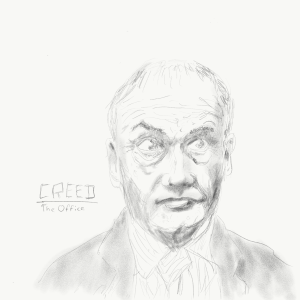
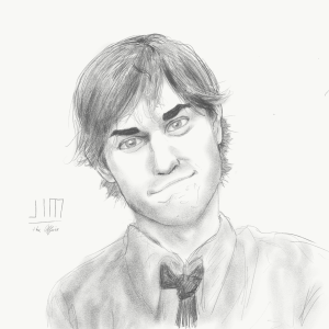
Below are 14 character sketches I’ve drawn based on the television program The Office (American version). They were created on an iPad Pro with a digital pencil. Many of these were originally posted on my Instagram account here.
- Darryl, The Office
- Meredith, The Office
- Kelly, The Office
- Creed, The Office
- Ryan, The Office
- Dwight, The Office
- Phyllis, The Office
- Kevin, The Office
- Stanley, The Office
- Pam, The Office
- Jim, The Office
- Toby, The Office
- Andy, The Office
- Michael, The Office
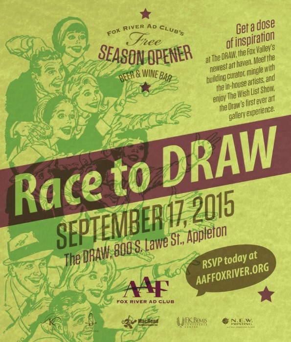
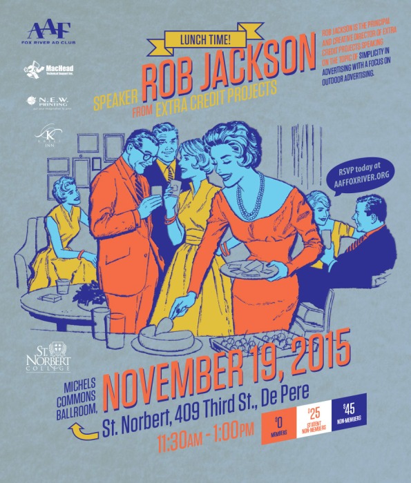
I’ve had the honor (and pleasure) of serving as the graphic designer for the AAF Fox River Ad Club this year including event posters, AAF Facebook imagery, eBlasts, flyers, and other collateral. Below are 8 of the found clip-art retro-ish posters.

Gallery Reception
Artisan Alley – Artist & Producer Series
Friday May 20th (5-8pm) & Saturday May 21 (10am-2pm)
With work by Ashley Megal and Chelsea Graham
1052 Main Street, Stevens Point, WI,
Poster design by Shawn Williams

Space-5.com is a new webcomic by Blayne Belter and Nick Devos. This is a quick chat with Blayne.
Blayne Belter: It’s an all ages comic (fun for kids and adults alike) about space travel and being lost. Our adventurers are trying to find their way back home to earth.
SW: What made you want to create webcomics?
BB: I’ve always wanted to create a story start to finish. Learning a bit about creating websites made me want to make something more custom that stood out a bit from the webcomic crowd. Also, it is free to publish and delivering content is pressure free!
SW: Why an all ages space theme?
BB: So much story telling freedom because so much is unknown. Always loved Star Wars and Marvel comics as kids. So we hope other kids can’t get enough of it like we couldn’t. You can hit on the science fiction aspect without being science specific.

BB: No you shouldn’t. This is a straight forward story, featuring boredom as the main theme.
SW: I understand on this webcomic you’ve done extensive character studies, do you want to tell us about your process?
BB: We started with the names. All of our characters are named after historic scientists and inventors. From there we gave them archetypal traits and they have been falling into place with ease as we have been creating dialogue and story.

BB: Wow. I have friends that can draw the pants off me (literally, they would make it look hilarious). I think it is more fair just to call me a story teller.
SW: What direction do you see the sequential art medium moving in?
BB: I think print and web are doing great. I think the original story telling is getting bigger and bigger. The big guys like Marvel and DC and their off shoots will always be fine, but the promotion Image has done to new content and some of the excellent web comics out there have played a huge role in getting other people involved. There really is something out there for anyone and everyone!

BB: Walking Dead… always. Thanks Dave at Powers Comics for starting me on it 10 years ago. I just started rereading Bone by Jeff Smith, because I love it and I have the whole Scholastic collection in color. Before that I reread Barry Ween by Judd Winnick. The last stash I bought was Afterlife with Archie (pretty good so far) and finished up my run with Batman and the great Scott Snyder and Greg Capullo. Saga is always a favorite too. OK. I have too many.
SW: And last but not least, when have you laughed the hardest?
BB: When a junior high school friend of mine lit a fart at my family cottage.
Just for fun, grab your (or your kids) toy lightsaber and have an epic lightsaber battle in the office… Why not? Friday, 12-18-15. This is also, as you know, the official release date of the Star Wars film The Force Awakens – of which I’m totally jazzed to see!!
Please I don’t want to hear about anyone getting in trouble or injured… Just use your Jedi training wisely and pick a lightsaber duel with your coworker!!

Check out this nutty animated GIF I whipped up for said event!
My friend is running for Town Clerk in the community outside New London, WI, and I helped make these simple signs. Vote for Heidi!


